Inclusive Wayfinding & Signage
Inclusive Wayfinding & Signage
Why Wayfinding Matters in Inclusive Playgrounds
Wayfinding is how people understand where they are, where they are going, and how to get there.
In a playground, this may seem simple, but for many people, it is not.
Children, disabled users, families, and first-time visitors all rely on clear information to move confidently through a space. Without it, a playground can feel confusing, stressful, or even unsafe.
Inclusive wayfinding removes that uncertainty.
It allows people to navigate independently, make choices, and fully participate without asking for help.
Wayfinding Is More Than Signs
Wayfinding is not just signage.
It includes:
Pathways and layout
Landmarks and visual cues
Sound, texture, and movement
Clear sightlines and orientation
Good wayfinding uses multiple types of information to help people understand a space.
Design guidance highlights that people rely on visual, tactile, and even environmental cues to orient themselves and navigate independently.
A sign alone is not enough. The whole environment must communicate clearly.
Clear, Simple, and Predictable Information
Wayfinding must be easy to understand.
This means:
Simple language
Clear directions
Logical placement
Consistent design
People should not need to stop and think too hard about where to go.
Inclusive design follows the principle of “simple and intuitive use”, making environments easy to understand for people with a wide range of abilities.
Confusing layouts and inconsistent signage create stress and reduce independence.
Use Multiple Ways to Communicate Information
Not everyone reads or understands information in the same way.
Inclusive signage should combine:
Text
Symbols
Arrows
Colour coding
Symbols are especially useful for people who have different languages, learning differences, or cognitive challenges.
Text alone can exclude. Visual communication supports understanding.
Good wayfinding gives people options.
High Contrast and Readability Are Essential
Signage must be easy to read.
This means:
Strong contrast between text and background
Clear, simple fonts
Adequate text size
Avoiding cluttered designs
Guidance emphasises that high contrast and clear lettering are critical for people with low vision and for general readability.
If a sign cannot be read quickly and easily, it fails its purpose.
Avoid Over complicated Signage
Too much information can be just as bad as too little.
Signs should be:
Clear and concise
Focused on key information
Free from unnecessary detail
Overloaded signs are harder to process, especially for children or people with cognitive differences.
Wayfinding should reduce mental effort, not increase it.
Tactile and Braille Signage
Inclusive signage must consider people who are blind or have low vision.
This includes:
Raised lettering
Braille
Tactile symbols
Accessible signage should be readable by both sight and touch, allowing more people to access information independently.
Engraved or flat text is not sufficient.
Tactile design is essential for true inclusion.
Placement and Height Matter
A sign must be where people can find and use it.
Accessible signage should be:
Placed at consistent, logical locations
Positioned at reachable heights (typically around 1200–1600 mm)
Located at decision points such as entrances and intersections
Guidance highlights that signage should be within reach for both standing users and wheelchair users.
If a sign cannot be reached or found, it cannot be used.
Wayfinding at Decision Points
Signs are most important where people need to make choices.
This includes:
Entrances
Path intersections
Transitions between zones
Near key facilities such as toilets and seating
Providing information at the right time reduces confusion and supports independence.
Wayfinding should guide people naturally through the space.
Use Landmarks and Environmental Cues
People do not rely on signs alone.
They also use:
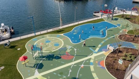
Distinctive play equipment
Colour zones
Textures and surfaces
Sounds and smells
Design guidance shows that landmarks and environmental cues help people orient themselves and understand where they are.
A bright swing, a shaded seating area, or a change in surface can all act as navigation tools.
Good design supports natural wayfinding.
Consistency Builds Confidence
Wayfinding systems must be consistent.
This means:
The same symbols are used throughout
The same colours represent the same areas
Consistent placement and layout of signs
Inconsistent signage creates confusion and reduces trust.
Consistency allows people to learn the system quickly and move with confidence.
Avoid Reliance on Technology Alone
Digital wayfinding tools and touchscreens can be helpful, but they should not be the only option.
Some users may:
Struggle with touchscreens
Have limited vision in bright light
Require tactile information
Guidance warns that touchscreens should not replace physical, accessible information.
Inclusive design always provides multiple ways to access information.
Bilingual and Inclusive Language
In New Zealand, signage should reflect the community.
This may include:
English and te reo Māori
Simple, inclusive language
Clear terminology
Bilingual signage supports cultural inclusion and improves accessibility for a wider range of users.
Language should welcome people, not exclude them.
Wayfinding Supports Safety
Wayfinding is also a safety feature.
Clear signage helps people:
Find exits
Locate toilets and facilities
Avoid hazards
Navigate safely in unfamiliar environments
In an emergency, clear wayfinding becomes critical.
People must be able to understand and act quickly.
Common Mistakes
Wayfinding and signage often fail due to poor design.
Signs placed too high or too low
Poor contrast or unreadable fonts
Too much information
Inconsistent symbols or colours
No tactile or braille options
Signs placed away from decision points
These issues create confusion and reduce accessibility.
A Lived Experience View
From lived experience, unclear wayfinding creates immediate stress.
Not knowing where to go, how to get there, or whether a path is accessible can stop a person from exploring a space.
For disabled users, this can mean:
Avoiding areas
Relying on others
Feeling uncertain or unsafe
Clear, consistent wayfinding removes that barrier.
It allows people to move independently and confidently.
Final Thought
Inclusive wayfinding is about more than signs.
It is about creating an environment that communicates clearly to everyone.
When done well, people move naturally, understand the space, and feel confident.
When done poorly, the playground becomes confusing and exclusionary.
Design for clarity. Design for independence.
Because everyone deserves to know where they are and where they can go.